Thursday, July 28, 2011

Tuesday, July 26, 2011

Scandinavian Beach House with Bright Blue Painted Floors

How cool is this Scandinavian beach house with the glossy blue floor? Remodelista have posted this image just today, however I couldn't resist and had to share. I've seen so many examples of white and dark painted floors - it's refreshing to see this summery bolt of blue for a change.
Photograph from Avotakka via Remodelista.

Peacock and Other Shades by Glen Proebstel

Enjoying this elegant and simple interior still life by Australian New Zealander stylist Glen Proebstel - what a lovely array of colours and materials.
I have had a lovely email from a reader who let me know that Glen is actually Kiwi! SO big apologies to Glen and great to see the talent from our side of the ditch doing so well overseas.
Photograph via KHM .

Monday, July 25, 2011

Casa de Palmela, a Holiday Home in Portugal


On this bitterly cold winter night, I am imagining that I am here at Casa de Palmela - the lovely country home belonging to interior designer, Monica Penaguiao. It is located in Palmela, just outside of Lisbon, Portugal. Such great combinations of pared-down rustic and modern, along with white and colour. Doesn't those sun beds with the Missoni towels just asks you to relax and enjoy the warm sun? I think they do. Read and see more HERE or be like me and just imagine you're there already. Nice.
Photographs via The Style Files.

Sunday, July 24, 2011

White Ornate Mirrors

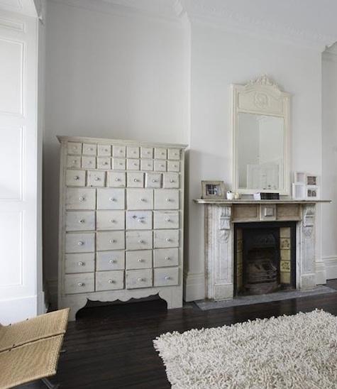
This is a similar set up to my client's house - an orante white mirror above the fireplace.


Smaller ornate mirrors in the bathroom.

Here are some great examples of using white ornate mirrors in interiors. We purchased a large white ornate mirror for a client last year and it sits above her fire place mantle (similar to the top photo). For the same client, we are now looking at a smaller white one for the soon to be renovated toliet.  This version will not be as ornate but a little bit of detail would be nice. 
Photographs via Remodelista.

Tuesday, July 19, 2011

New Work - Soft Furnishings for a Media Room.

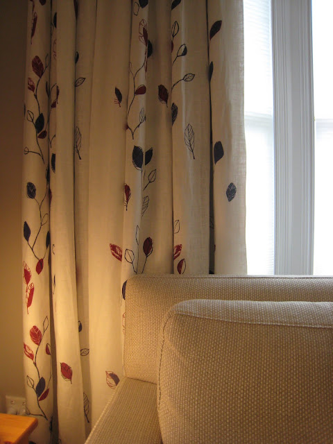
An updated and cosy media room with new soft furnishings and drapes.
A comfortable new sofa from David Shaw and new drapes with a falling leaf pattern.
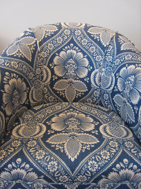
We re-upholstered the previously 'blah' cream chairs in this great patterned fabric.
Close up detail of this fabric from Westbury.
And for interest, we did one in each colour.
I got a chance to visit a client earlier this week to see the results of a job I worked on. My clients wanted to update their media room with new soft furnishings, drapes and to make the room more cosy. It was great to see everything in place and looking really good.
If you are interested in the fabrics and new furniture used here, they are available through Charlotte Minty Interior Design.
Photographs by Charlotte Minty.

Monday, July 18, 2011

Ted Muehling Store in NYC

Ted Muehling jewellery store in NYC. Photograph by Ditte Isager.
Here is an elegant jewellery store in New York that goes by the name of its jewellery designer, Ted Muehling. I like the homely and gentle feel of the store as well as its interesting displays and grey panelled walls. Stylist Sibella Court is a fan - in fact, from her book 'The Stylists Guide to NYC', she says "If you're feeling flat (actually if you're in any kind of mood), come here. Not only for his beautiful nature-inspired jewellery but also his coral-inspired spoons. The panelled walls are often pinned with dragonflies and sea creatures." Sounds lovely.
Photograph via Ditte Isager.

Sunday, July 17, 2011

The Home of Orla Kiely


It is always interesting to see homes of designers, especially a successful one like Orla Kiely, and how they translate their design style from their work to their home.
Kiely has transformed this three storey Victorian house in Clapham, London, into a home for her family by using great colours like olive, ochre and grey on the walls and shots of vibrant colours with furniture and objects. I like the pared down Scandinvian feel of the home along with the nostalgic touches of Kiely's textiles.
Photographs by Chris Tubbs via The London Magazine.

Thursday, July 14, 2011

Patterns, Prints and Drapes.


New drapes for a client's home - this one in lovely faded vintage style floral fabric.


A great colourful paisley for the main Living area.

I had some drapes installed into a client's house this week and I think they came up beautifully. I have enjoyed working on this job as it is a character home and the client is working a mix of traditional and modern aesthetic throughout the house. So we aimed for patterned fabrics that had a traditional touch but still looked fresh and contemporary. These print fabrics from Westbury Textiles worked well into the scheme. All fabrics are available through Charlotte Minty Design.
Photographs by Charlotte Minty and via Westbury Textiles.

Wednesday, July 13, 2011

Tuesday, July 12, 2011

Roman and Williams by Ditte Isager

The designers Robin Standefer and Stephen Alesch from Roman and Williams.


I have talked about the cool design company, Roman and Williams before - especially about their Ace Hotel in New York. Here is a photographic profile on them by photographer Ditte Isager. These are great interior shots of what I am assuming is their office and home.
Photographs via Ditte Isager.

Monday, July 11, 2011

Using Pattern and Prints

Wallpaper
Fabric to re-upholster a chair
Fabric for drapes.
I am enjoying the use of pattern and prints in a recent job of mine. The intention is to keep the spaces simple with a shot of pattern. All fabrics and wallpaper are available through Charlotte Minty Design.

Sunday, July 10, 2011

Serpentine Gallery Pavilion 2011 by Peter Zumthor


The entrance to the mysterious pavilion.


The surrounding corridor.

First glimpse of the contemplative garden and courtyard.


This year's Serpentine Gallery Pavilion at Kensington Gardens, London has been designed by Swiss architect, Peter Zumthor with Dutch garden designer Piet Oudolf. At first impression, the lightweight black timber structure seems unassuming. However, as you walk into the perimeter of the building, a surrounding corridor, you get a glimpse of a 'secret' contemplative garden.
"The concept", says Zumthor, "is the hortus conclusus, a contemplative room, a garden within a garden. The building acts as a stage, a backdrop for the interior garden of flowers and light. Through blackness and shadow one enters the building from the lawn and begins the transition into the central garden, a place abstracted from the world of noise and traffic and the smells of London – an interior space within which to sit, to walk, to observe the flowers. This experience will be intense and memorable, as will the materials themselves – full of memory and time." - The Guardian.
The Pavilion is open from July through to October 2011.
Photographs by Julian Lanoo via Dezeen.